Sunday, 27 December 2009

Additional Projections

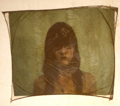
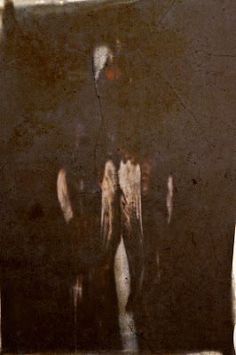
I felt that I should show more than just two examples of the experimental projections I have been playing with and so here are some additional photos.

Pheasants, Transparencies and an Over-Head Projector

As mentioned before I was struck by the direct 1:1 scale that Richard Learoyd employed when constructing and displaying his work. Obviously the resources and funds available to me in creating my own work could not rival Learoyd's, however I could still experiment with scale, something which I have been meaning to do for some time now.

In keeping with my Polaroid approach I wanted to keep the projections rooted in the physical object, though this may seem somewhat contradictory as the projection is an ephemeral creation of light. I did not feel that projecting an image which was a digitally encoded copy of the original would be particularly beneficial to my project, other than to alter the scale of the image and so shied away from using a digital projector and laptop. After having experimented with emulsion lifts and looking particularly at the transparent qualities that the images possessed I felt that this would be a way of projecting them which was truer to my original concept.

I projected the images onto a bare interior wall. This allowed me to capture both the projected image and the texture of the wall, giving another dimension to the images. The limitations of depth of field become apparent in these images again, as the images dry they become fragile and almost brittle, the image becomes distorted and the parts of the transparency not flat to the platen at the base of the projector are not in sharp focus. Colours also suffer somewhat when using this method of projection however I feel that the 'physical' approach to the projection of my images does in some way benefit from these limitations. I also experimented with the idea of distorting the image by the angle of the projection, as can be seen below, the image becomes stretched by projecting it into a corner, whilst one plane can still be seen clearly.


The 'hand-crafted' and 'unique' aesthetic adds rather than detracts, suggesting echoes of the past projected onto the present physical surface. In a way I feel that this could even link to the work of another artist, Rachel Whiteread, whose works such as Ghost (upper) and House (lower), are interior casts of inhabited spaces. The space is coated with plaster and as the plaster casts are pulled away from the original surfaces, detritus and residual traces of previous inhabitants are fixed into it to create an almost 'negative' image of the original. Whiteread's work is also on a scale of 1:1, the casts being created direct from the original space and, in the case of Ghost and House, erected on the site of the initial building. The works deal with filling the uninhabited space, as in her later works in which she cast around books in a library, titled Nameless Library.


I feel that in displaying my work I can utilise the approaches of both Learoyd and Whiteread regarding scale and their individual aspects of the unique image and the residual traces of history held by an object. As a final display for my work a projection of some sort onto a surface with 'history' may be something to consider, this would preferrably be some sort of enclosed interior space rather than an exterior wall.


Richard Learoyd and the Camera Obscura

Richard Learoyd's images are quietly unique. He captures his subjects with a shallow focus and soft, subtle colours and tones through a particular and somewhat unusual method, utilising a modern Camera Obscura, a camera the size of a room. The camera itself is fixed, as opposed to the traditional camera which is brought to a scene or an object to document it, instead, with Learoyd's camera the objects are brought to it. This also adds to the impression of crystalline moments captured outside of time, there is no constantly shifting and changing background which is captured, rather, the beautiful clear images which seem removed from the world outside the rooms of the camera, his images are 'sustained within their own hermetic condition'. His subjects are intimate, ranging from straight portraits to tableaux of dead animals, with compositions which have been described as 'artless' yet 'belie complex and restrictive rules dictated by the physics and optics of light' (see bibliography at end for consulted sources).
His images hold a quality that is so removed from context and temporality perhaps because the very method by which they are made dates back to the dawn of photography. Described as carrying 'visual echoes of the past' the limitations of the camera create a sense of stillness and serenity, complete with shallow focus and vignettes akin to the low-tech approach of modern Holga users as in the image below. (Richard Learoyd, 'Agnes with Eyes Closed', 2007. Museum no. E.421-2008)


Learoyd's images are also particularly interesting when brought to bear on my own project, his images, as with Polaroid, are completely unique. Each image is created by projecting onto positive photo-paper and developed in the very room in which it is exposed, this means there is no interposing negative, whatever is written onto the paper is written in direct light alone, this gives an indefatigable truth to the images. This has been described as Learoyd's search for the 'ultimate' image, coupled with the scale of his images, which are 1:1 with his original subject. This specific trait has been described as the image being 'concieved as a whole, not as fragments or miniaturisations of objects and people' unlike most photography.


Where my work resembles Learoyd's in its creation of a unique image which cannot be directly copied or mimicked, it differs in its approach to scale and presentation. My own images are small, limited as they are by the Polaroid film which I chose to use, fixed at their present size of 3.25" by 4.25", whereas Learoyd's displays are life-size, images which sit on the same scale as the viewer. I began to experiment with ways to address this which I will discuss in my next post.

Bibliography:

(Some websites have been consulted but not quoted from.)

http://www.union-gallery.com/content.php?page_id=2640

http://www.vam.ac.uk/images/image/46053-popup.html

http://mckeegallery.com/exhibit/2009/richard-learoyd-unique-photographs/

http://blogs.telegraph.co.uk/culture/lucydavies/100001214/richard-learoyd/
http://www.artrabbit.com/uk/events/event&event=3624

Tuesday, 22 December 2009

Pheasants and Snow

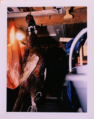
We were recently given some pheasants by a family friend who goes shooting. For me this was an unexpected treat as I had been meaning to photograph these for some time. I had particularly wanted to photograph them with my Polaroid camera and so now was my chance. I took the two birds out into the garden and hung them in a few different places, lighting the images with a single hotshoe flash held in my hand. The first attempts were not so successful, the pheasants were hung from a hook in my shed, I was hoping for an eclectic and rustic feel with all the clutter as a background but it wasn't working so well so I decided to use a similar approach to how I had photographed flowers previously.

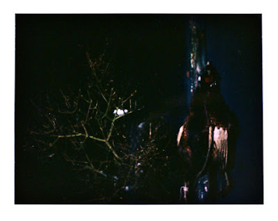
I took the pheasants outside and hung them against plainer and flatter backgrounds. In the image below I hung the pheasants on a corner of the shed and included the trees in as well so as to further connect with my previous images of flora. The image bears some resemblance to Renaissance still-life paintings in which dead animals or more simply 'meat' were a symbol of wealth and distinction. The pheasants plumage is also particularly striking in an image, though the colours are somewhat muted in this particular photograph.
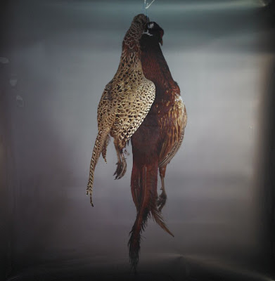
The images with which I most associate the depiction of pheasants with, however, are not historical paintings of the landed gentry and their landscapes but instead the work of a photographer called Richard Learoyd. His image below struck me, as well as his method of working being particularly interesting, in that he uses a walk-in camera obscura, which I will discuss in a later post.
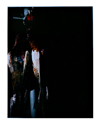
I also took further pictures against plain backgrounds, hanging the pheasants from a clothes-line pole, this did give me a more empty background and allowed the colours to stand out far more effectively but did leave me with images which contained elements I did not want in there, the image below is an example of this. I considered editing out these elements in Photoshop however decided to discard it from my more finalised work as I felt that working in Polaroid film requires un-tampered with pictorial reality and the results of my Photoshopping would not be visible on the original image anyway. I believe there is an intrinsic link between Polaroid and the 'Truth', however subjective it may be. This edited image is furthest below.

Friday, 4 December 2009

The Low-Fi Approach to Video, The Harinezumi and Super 8

It began to occur to me that using a mini dv camera for the video aspect of a project which began with a holga, old polaroid camera and instant film didn't quite add up. As the approach I started out with was using simple, out-dated technology so as to produce a physical object, using a video camera whereby the end product is a well-controlled, well-exposed image in the form of a piece of digital encoding didn't quite seem to fit.

I thought back to a product I had seen a few months ago, The Harinezumi digital video camera(below).

This camera is a small, compact and fairly low-tech approach to video, from Superheadz, in the same vein as the Holga or Diana. The Harinezumi's aesthetics are dream-like, with a strong emphasis on the "artless" over the perfected image. With only a 2mp CCD sensor the images lack the definition and contrast of a more typical video camera yet have a charm of their own. Even the LCD screen which usually comes as standard is discarded when shooting on the Harinezumi camera, instead relying on a small square plastic view-finder which pops up just above the lens, in a similar design to the Ikimono 110 cameras (below). Below is an example of the kind of footage the Harinezumi captures.


Not ony do the Harinezumi's images harken back to earlier 8mm film stock, (traditionally used to capture family movies) just like 8mm film sound is absent. I feel that using this camera would be useful to my work but I didn't feel I could justify spending over a hundred pounds on such a low-tech camera. Instead I began to research alternative ways of getting a 'low-tech' and ultimately outdated look to my film, relying on the medium over cheap after effects in Finalcut. I then discovered that both 8mm and Super 8 film were still available to buy and develop. Though development costs are fairly high the initial start-up for the equipment- camera, projector and film splicer- were relatively cheap.

I intend to use Super 8 film over 8mm as, though both offer the warmly-toned grainy images Super 8 has a larger film area, magnetic sound-strip and creates a direct film strip over the colour-negative of the 8mm, which then requires a print to be made of it before it can be projected. This also links to my original polaroid idea of the intangible becoming a physical object.(below: upper-Super 8 film. lower- 8mm film.)

'Flash' Films Attempt 2

Following on from my previous attempt to film flowers in the dark with a hotshoe flash I decided to go for a more controlled set-up. I had learned from my previous experiments with this technique that the results were tempermental at best, often the video camera would not catch the flash at all, leaving an entirely black screen, other times the frame would only be half-exposed. As well as this there were problems when transferring from the tape to the mac, often frames shot at a high shutter speed are skipped over and, as each flash is only a few hundredths of a second this means that no image appears in the shot at all.

To ensure atleast some video footage I decided to shoot at all the speeds available on the camera, from 1/50th to 1/2000th of a second. I also used a reflector so as to bounce more light back into the shot and hopefully give a more professional look to the shots. A great drawback when shooting at such high speeds and relying on an exposure which is barely registered by the naked eye is that, without a slow-motion playback setting on the camera the results cannot be seen or any problems rectified until played back in the edit-suite. With the method I employed I was more or less shooting blind.

The video below is the edited results of this experiment. Many of the shots did not work the way I had planned, common problems were the changing colour of the shots, the splitting of shots into upper and lower frames, as can be seen in the first two attempts, and the amount of static shots which this method leads to.

I have also begun working on a sound-scape which should hopefully hold the film together and add more action or intrigue. I also intend to cut down some of the shots, particularly the long static shots of the plants lit against the background. I intend to re-shoot this in the studio, however do not expect greatly improved results and so, as an alternative to this, will begin to look at shooting more well-lit images, not lit by a flash, and playing them back in slowmotion so as to still link to this. Again Zabriskie Point will be a referrence for this. I also intend to continue with the idea of the fragile made solid by playing with the audio track for this idea, the idea I have, though quite trite and cliched, is the use of a sound-scape made from the noises of glass played whilst flowers fall in slow-motion. Though I do not intend to continue this as my final piece I feel it is a valuable stepping stone towards some sort of resolution of this project.